Desktop and responsive web
Desktop and responsive web
Research, UX Strategy, Brand Integration
Research, UX Strategy, Brand Integration
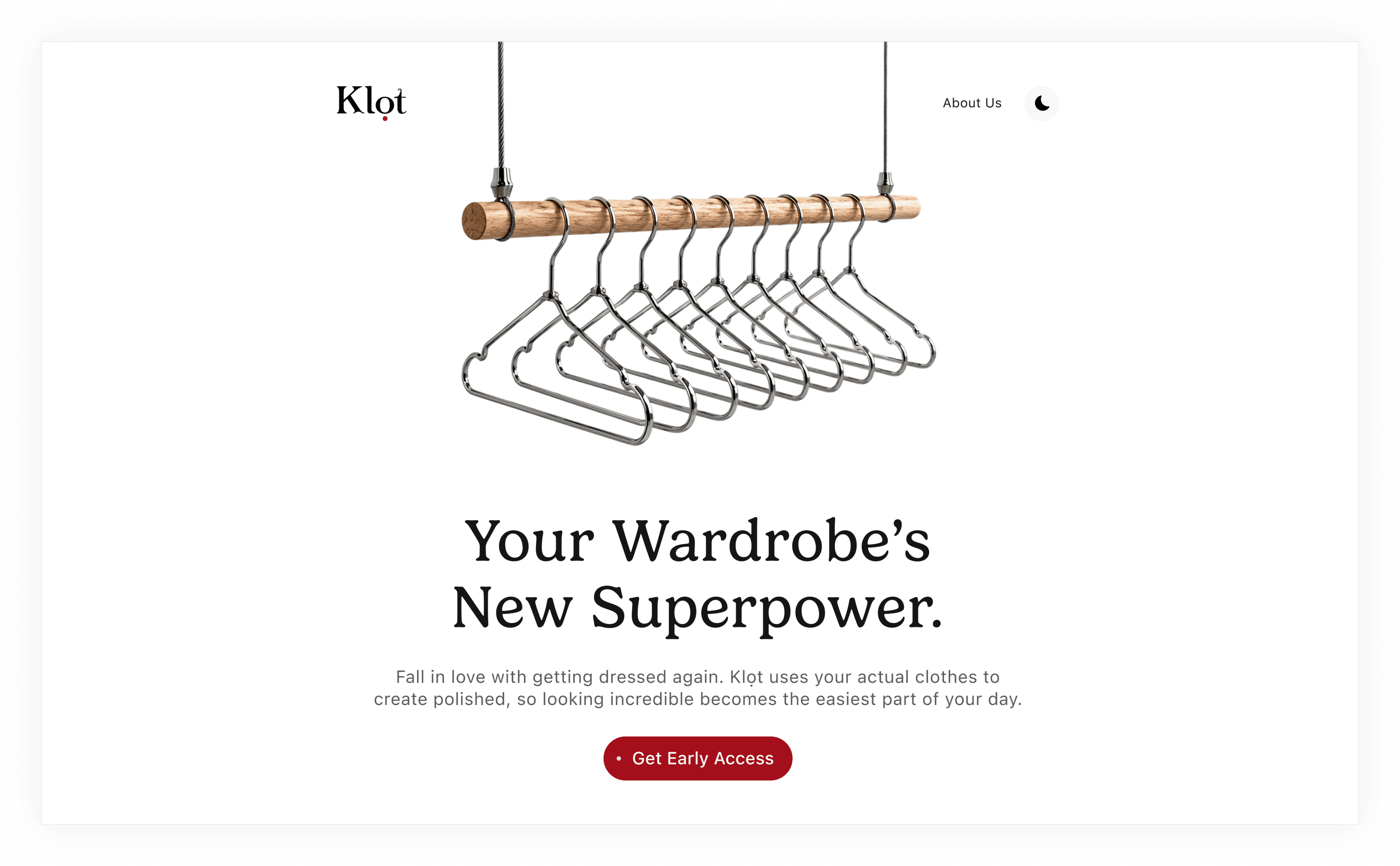
Design a launch website that introduces Klọt, an AI-powered wardrobe assistant that will generate early user adoption, and communicate a future fashion experience without alienating mainstream consumers.
Design a launch website that introduces Klọt, an AI-powered wardrobe assistant that will generate early user adoption, and communicate a future fashion experience without alienating mainstream consumers.
Design a launch website that introduces Klọt, an AI-powered wardrobe assistant that will generate early user adoption, and communicate a future fashion experience without alienating mainstream consumers.
Many users wear only a small portion of the clothes they own, struggle to discover new outfit combinations, and continue purchasing items they don't need. Despite having numerous options, a simple question - "What do I wear today?" can still feel surprisingly difficult to answer. This leads to our problems; decision fatigue, reduced confidence, and a wardrobe that feels less useful than it actually is.
We started by defining the challenge: introducing wardrobe intelligence as a new category while making its value immediately clear. The experience needed to feel distinct from both traditional fashion retail and AI products.
From there, I studied how premium brands introduce unfamiliar concepts without overwhelming users and understand how they balance aspiration with simplicity. Early explorations on Figma, focused on visual storytelling, information hierarchy, and the goal was not to explain every feature immediately, but to create enough intrigue and trust for users to continue exploring.
Once the positioning became clear, I began translating the brand into a visual system. The hanger was chosen as the primary visual metaphor because it represents possibility rather than product. Typography paired editorial serif headlines with modern sans-serif body copy to create a balance between refinement and intelligence. The color palette centered around deep crimson accents against generous white space, creating a premium, confident presence while distinguishing Klọt from the blue and purple visual language common in AI products.
The final phase was refinement. I tightened spacing, typography hierarchy, imagery placement, and conversion touchpoints to create a cohesive experience. Particular attention was given to rhythm and pacing, allowing the page to feel intentional rather than feature-heavy. Every visual decision used in this project reinforces clarity, discovery, and confidence which aligns with the brand’s vision. I brought this vision to live with Framer.
1. Establish Credibility: Users needed to trust an AI-driven styling product immediately.
2. Drive Early Access Signups: Every design decision needed to support conversion.
3. Differentiate From Fashion E-commerce: Klọt is not another clothing store. The website needed to communicate intelligence rather than inventory.
I established a foundational design system covering typography, color tokens, spacing, grids, components, and interaction patterns to create a unified visual language. While this case study focuses on the website experience, The system is being extended to support the upcoming mobile application, ensuring continuity across the growing Klọt ecosystem.
KEY DESIGN CONSIDERATIONS
Why Not Just Use a Futuristic Font for The headline?
Why Not Just Use a Futuristic Font for The headline?
Why Not Just Use a Futuristic Font for The headline?
A futuristic typeface might seem like the obvious choice for an AI product.
However, futuristic fonts often introduce problems like: reduced readability, short-lived trends, excessive visual noise and "sci-fi" associations but the goal wasn't to make Klọt look futuristic, it was to make Klọt feel like the future.
And I used a sans-serif supporting text for: readability, minimalism and product communication.
Why Introduce a Human Face in the About Section?
Why Introduce a Human Face in the About Section?
Why Introduce a Human Face in the About Section?
Up to this point the interface felt highly conceptual.
Introducing the portrait of a woman represents the human side of the product, The crimson circle reflection in the eyes symbolizes a new perspective of seeing opportunities, combinations, and value that were previously overlooked. It reinforces the idea that Klọt's role is not to change who users are, but to help them see their wardrobe, and themselves, with greater clarity. The portrait also reinforces the future positioning through dramatic styling and lighting.
Why make the Final CTA Section “red” (on both light theme and dark theme)?
Why make the Final CTA Section “red” (on both light theme and dark theme)?
Why make the Final CTA Section “red” (on both light theme and dark theme)?
I used red for the final to create a decisive moment in the user journey. Throughout the experience, red serves as Klot's signature brand color, so amplifying it at the end reinforces brand recall, creates visual emphasis, and signals that this is the most important action on the page : Join the Early Access List.
This project taught me that premium design is less about adding more but about refining what matters. Through multiple iterations, I gained a deeper appreciation for how typography, hierarchy, and spacing influence brand perception, and how simplifying visual elements can create a more elegant, memorable, and user-focused experience.
OTHER DESIGN EXPLORATIONS ON KLỌT
The challenge was never designing a website. It was introducing a new category by balancing fashion, AI technology, and lifestyle. i made the experience feel both aspirational and accessible and the result is a launch website that builds trust, sparks curiosity, and creates anticipation for the future of fashion.
The challenge was never designing a website. It was introducing a new category by balancing fashion, AI technology, and lifestyle. i made the experience feel both aspirational and accessible and the result is a launch website that builds trust, sparks curiosity, and creates anticipation for the future of fashion.
The challenge was never designing a website. It was introducing a new category by balancing fashion, AI technology, and lifestyle. i made the experience feel both aspirational and accessible and the result is a launch website that builds trust, sparks curiosity, and creates anticipation for the future of fashion.